Responsive Navigation in TanStack Start: Hamburger Menu and Desktop Navbar
Build a mobile-first header with Tailwind CSS and TanStack Router, with a hamburger menu, active links, and accessibility basics.
https://www.youtube.com/watch?v=_-0DDuQseSo
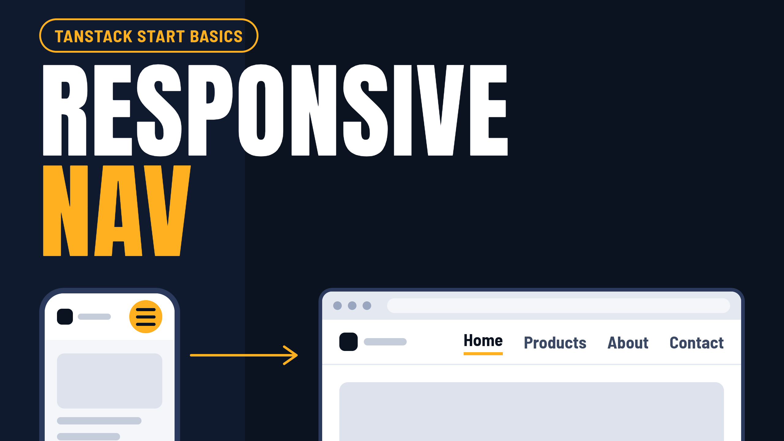
A header that works on a phone and on a desktop is one of the first things every site needs. In this part of the TanStack Start Basics series, we'll build one with inline links on wide screens, a hamburger menu on small ones, and a few accessibility details that are easy to skip.
You can watch the video here: [link]. Everything below is the written version.
Write the links once
Start with a single list of links that both menus will read from:
// src/lib/nav.ts
export const navLinks = [
  { to: '/', label: 'Home' },
  { to: '/products', label: 'Products' },
  { to: '/about', label: 'About' },
  { to: '/contact', label: 'Contact' },
] as const;
The as const lets TypeScript treat every to as an exact route, so a typo is a compile error and not a broken link.
Think mobile first
Tailwind is mobile first. Classes without a prefix apply to every screen size, and a prefix such as md: applies from that width upward. So the plan is to style the phone version first, and then add the desktop changes on top:
hidden md:blockis hidden on phones and shown from 768px up (the desktop links)md:hiddenis shown on phones and hidden from 768px up (the menu button and the mobile menu)
A separate NavLinks component
Both menus need the same list of links, so it gets its own component. Start with the props type:
// src/types/index.ts
export type NavLinksProps = {
  listClass: string;
  linkClass: string;
  activeClass?: string;
  onNavigate?: () => void;
};
Then the component:
// src/components/NavLinks.tsx
import { Link } from '@tanstack/react-router';
import { navLinks } from '@/lib/nav';
import type { NavLinksProps } from '@/types';

export default function NavLinks({
  listClass,
  linkClass,
  activeClass = 'text-black underline underline-offset-4',
  onNavigate,
}: NavLinksProps) {
  return (
    <ul className={listClass}>
      {navLinks.map((link) => (
        <li key={link.to}>
          <Link
            to={link.to}
            activeOptions={{ exact: link.to === '/' }}
            className={linkClass}
            activeProps={{ className: activeClass }}
            onClick={onNavigate}
          >
            {link.label}
          </Link>
        </li>
      ))}
    </ul>
  );
}
The two class props let each menu style the list its own way. activeClass has a default, so most callers can leave it out, and onNavigate is optional, so the desktop menu doesn't need it. Because the component lives in its own file, you can reuse it later, in a footer for example, without copying anything.
The header
// src/components/Header.tsx
import { useEffect, useState } from 'react';
import { Link } from '@tanstack/react-router';
import { Menu, X } from 'lucide-react';
import NavLinks from '@/components/NavLinks';

export default function Header() {
  const [open, setOpen] = useState(false);

  useEffect(() => {
    if (!open) return;
    const onKeyDown = (e: KeyboardEvent) => {
      if (e.key === 'Escape') setOpen(false);
    };
    window.addEventListener('keydown', onKeyDown);
    return () => window.removeEventListener('keydown', onKeyDown);
  }, [open]);

  return (
    <header className="border-b bg-white">
      <div className="mx-auto flex h-16 max-w-6xl items-center justify-between px-6">
        <Link to="/" className="text-lg font-bold">
          My Store
        </Link>

        <nav aria-label="Main" className="hidden md:block">
          <NavLinks
            listClass="flex items-center gap-6"
            linkClass="text-sm font-medium text-neutral-600 hover:text-black"
          />
        </nav>

        <button
          type="button"
          onClick={() => setOpen((o) => !o)}
          aria-label={open ? 'Close menu' : 'Open menu'}
          aria-expanded={open}
          aria-controls="mobile-menu"
          className="flex size-11 items-center justify-center rounded-md md:hidden"
        >
          {open ? <X className="size-6" /> : <Menu className="size-6" />}
        </button>
      </div>

      {open && (
        <nav
          id="mobile-menu"
          aria-label="Mobile"
          className="border-t md:hidden"
        >
          <NavLinks
            listClass="flex flex-col px-6 py-2"
            linkClass="block py-3 text-base font-medium text-neutral-600 hover:text-black"
            onNavigate={() => setOpen(false)}
          />
        </nav>
      )}
    </header>
  );
}
Closing the menu when you navigate
If you skip this, you'll notice a bug: you tap a link, the page changes, and the menu stays open. The header lives in a layout route, and a layout stays mounted while the pages inside it change, so its state is never reset.
The fix is to close the menu in the link's click handler, which is where the user's action happens. React's documentation recommends handling things caused by a user action in the event handler for that action, and not in an effect. So NavLinks gets an optional onNavigate prop, and only the mobile menu passes () => setOpen(false).
This also closes the menu when you tap the link for the page you're already on, which an effect that watches the path would miss. If you also want the menu to close when the user presses the browser's back button, you can add an effect that watches the path on top of this, but the click handler covers the main case.
Active links
Link knows when it points at the current page, and activeProps lets you style that state. Every path starts with a slash, so the home link would look active everywhere. activeOptions={{ exact: true }} fixes that, and the code above applies it only to the home link.
Accessibility basics
Use a real
buttonfor the toggle, withtype="button", so the keyboard can reach itLabel it with
aria-label, and update the label with the stateUse
aria-expandedandaria-controlsso assistive technology knows whether the menu is openClose the menu with the Escape key
Give each
navits own label, so a screen reader user can tell them apart
Use it in the layout
// src/routes/_appLayout.tsx
import { createFileRoute, Outlet } from '@tanstack/react-router';
import Header from '@/components/Header';

export const Route = createFileRoute('/_appLayout')({
  component: AppLayout,
});

function AppLayout() {
  return (
    <>
      <Header />
      <main className="mx-auto max-w-6xl px-6 py-8">
        <Outlet />
      </main>
    </>
  );
}
Try it
Open your browser's device toolbar and drag the width between 375px and 1024px. The hamburger should appear below 768px, and the inline links above it. Tap a link in the mobile menu and check that it closes.
What's next
In the next part, we'll look at slide-in animation and a dark mode toggle. If you got stuck anywhere, leave a comment on the video.