Build a Slide-In Mobile Menu in TanStack Start with Tailwind v4
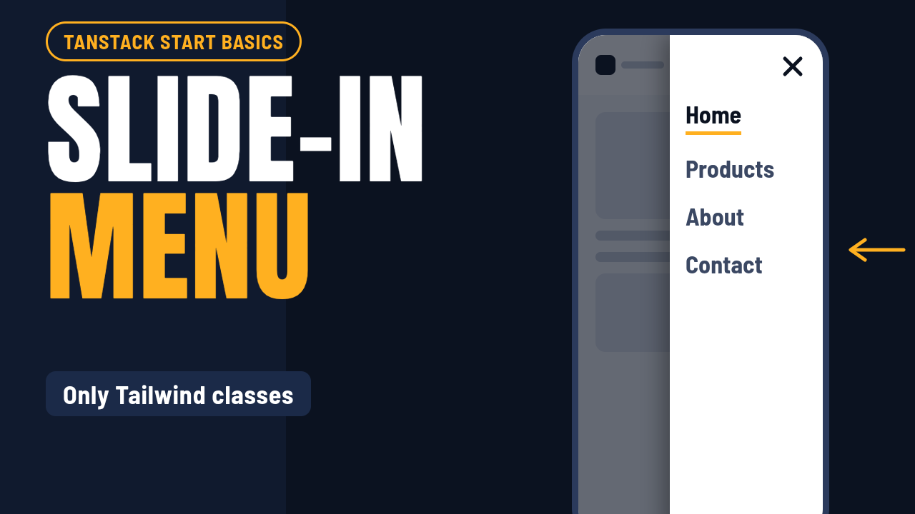
Turn a pop-in mobile menu into a sliding drawer with a fading backdrop, using only Tailwind classes, and keep it accessible.
https://www.youtube.com/watch?v=4oE4P7uGF3Y
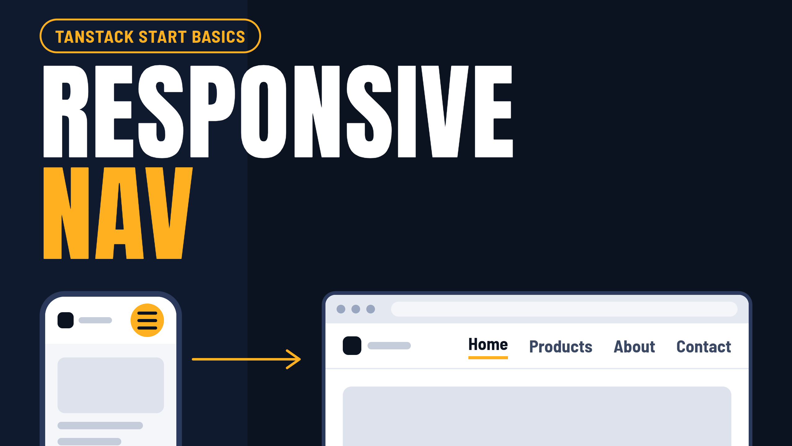
A mobile menu that pops in and out works, but it feels unfinished. In this article we turn it into a drawer that slides in from the right with a fading backdrop, using only Tailwind classes and no animation library. We also keep it usable for keyboard and screen-reader users, lock the page scroll while it is open, and respect the reduced-motion setting.
This is part of the TanStack Start Basics series. It builds on the responsive Header and the separate NavLinks component from the previous part.
Remove the old mobile menu
In the previous part, the mobile menu lived in the Header, underneath the flex container, and the hamburger button toggled it. Delete it. This is the code to remove:
{open && (
  <nav
    id="mobile-menu"
    aria-label="Mobile"
    className="border-t md:hidden"
  >
    <NavLinks
      listClass="flex flex-col px-6 py-2"
      linkClass="block py-3 text-base font-medium text-neutral-600 hover:text-black"
      onNavigate={() => setOpen(false)}
    />
  </nav>
)}
When open is false, React removes this menu from the page completely. A CSS transition needs an element that exists in both the start and end states, so there is nothing to animate. The fix is a side panel that is always on the page, which we slide off screen with Tailwind.
Always render the panel
Here is the side panel. It replaces the old menu in the same position in the header. It uses a cn helper, so you will also need this function in the utils file in your lib folder. If you use shadcn/ui, you already have it. Otherwise, install clsx and tailwind-merge (npm i clsx tailwind-merge) and add:
// src/lib/utils.ts
import type { ClassValue } from 'clsx'
import { clsx } from 'clsx'
import { twMerge } from 'tailwind-merge'

export function cn(...inputs: ClassValue[]) {
  return twMerge(clsx(inputs))
}
The panel also uses the X icon, so add these imports at the top of Header.tsx if you don't have them yet:
import { X } from 'lucide-react'
import { cn } from '@/lib/utils'
<nav
  id="mobile-menu"
  aria-label="Mobile"
  className={cn(
    'fixed inset-y-0 right-0 z-50 w-72 bg-white p-6 shadow-xl md:hidden',
  )}
>
  <button
    type="button"
    onClick={() => setOpen(false)}
    aria-label="Close menu"
    className="mb-6 ml-auto block rounded p-2 hover:bg-gray-100"
  >
    <X className="size-6" />
  </button>
  <NavLinks
    listClass="flex flex-col gap-4"
    linkClass="text-lg text-gray-600 hover:text-black"
    onNavigate={() => setOpen(false)}
  />
</nav>
Make it jump in and out
To move the panel on and off the screen, add Tailwind's translate classes with a ternary on open:
open ? 'translate-x-0' : 'translate-x-full',
Add it as a second argument to cn on the <nav>:
<nav
  id="mobile-menu"
  aria-label="Mobile"
  className={cn(
    'fixed inset-y-0 right-0 z-50 w-72 bg-white p-6 shadow-xl md:hidden',
    open ? 'translate-x-0' : 'translate-x-full',
  )}
>
  {/* the close button and NavLinks stay the same */}
</nav>
The panel now jumps on and off the screen, but it doesn't slide yet.
You may have noticed the helper function cn. It joins class names, skips the ones that are false, and if two Tailwind classes conflict, the last one wins.
Add the backdrop
Next, a dark layer behind the panel. Clicking it closes the menu, which is what people expect from a drawer. It sits one layer below the panel (z-40 against z-50) and covers the whole screen. When the menu is closed it must not catch clicks, so pointer-events-none is not optional here. Without it, an invisible full-screen layer would swallow every tap on the page. Put it right above the <nav>:
<div
  aria-hidden="true"
  onClick={() => setOpen(false)}
  className={cn(
    'fixed inset-0 z-40 bg-black/50 md:hidden',
    open ? 'opacity-100' : 'pointer-events-none opacity-0',
  )}
/>
This is how it should look in your code:
<div
  aria-hidden="true"
  onClick={() => setOpen(false)}
  className={cn(
    'fixed inset-0 z-40 bg-black/50 md:hidden',
    open ? 'opacity-100' : 'pointer-events-none opacity-0',
  )}
/>
<nav
  id="mobile-menu"
  aria-label="Mobile"
  className={cn(
    'fixed inset-y-0 right-0 z-50 w-72 bg-white p-6 shadow-xl md:hidden',
    open ? 'translate-x-0' : 'translate-x-full',
  )}
>
  <button
    type="button"
    onClick={() => setOpen(false)}
    aria-label="Close menu"
    className="mb-6 ml-auto block rounded p-2 hover:bg-gray-100"
  >
    <X className="size-6" />
  </button>
  <NavLinks
    listClass="flex flex-col gap-4"
    linkClass="text-lg text-gray-600 hover:text-black"
    onNavigate={() => setOpen(false)}
  />
</nav>
Make it slide
Now the fun part, and it takes two classes. transition-transform tells the browser to animate changes to the position, duration-300 makes it take 300 milliseconds, and ease-out makes it start fast and settle gently. The backdrop gets the same treatment, but it fades, so it uses transition-opacity.
Add this to the panel:
transition-transform duration-300 ease-out
Add this to the backdrop:
transition-opacity duration-300
Your code should look like this:
<div
  aria-hidden="true"
  onClick={() => setOpen(false)}
  className={cn(
    'fixed inset-0 z-40 bg-black/50 transition-opacity duration-300 md:hidden',
    open ? 'opacity-100' : 'pointer-events-none opacity-0',
  )}
/>
<nav
  id="mobile-menu"
  aria-label="Mobile"
  className={cn(
    'fixed inset-y-0 right-0 z-50 w-72 bg-white p-6 shadow-xl transition-transform duration-300 ease-out md:hidden',
    open ? 'translate-x-0' : 'translate-x-full',
  )}
>
  <button
    type="button"
    onClick={() => setOpen(false)}
    aria-label="Close menu"
    className="mb-6 ml-auto block rounded p-2 hover:bg-gray-100"
  >
    <X className="size-6" />
  </button>
  <NavLinks
    listClass="flex flex-col gap-4"
    linkClass="text-lg text-gray-600 hover:text-black"
    onNavigate={() => setOpen(false)}
  />
</nav>
One Tailwind v4 detail: translate-x-* sets the CSS translate property, not transform. In v4, transition-transform includes translate, so this works. If a slide ever refuses to animate, check that your transition covers translate.
Hide the closed panel
It looks right, but there is a catch. The panel is only parked off screen. Press Tab with the menu closed and focus disappears into links you can't see, and a screen reader will still read them out. The fix is the invisible class when the menu is closed.
If we add invisible and nothing else, the panel vanishes the instant you close it, and the slide-out never shows. So we also tell the transition to animate visibility, not just position. The browser keeps the panel visible until the slide finishes, then hides it.
Make two changes to the panel:
Replace
transition-transformwithtransition-[translate,visibility].Replace
translate-x-fullwithinvisible translate-x-full.
Your code should look like this:
<div
  aria-hidden="true"
  onClick={() => setOpen(false)}
  className={cn(
    'fixed inset-0 z-40 bg-black/50 transition-opacity duration-300 md:hidden',
    open ? 'opacity-100' : 'pointer-events-none opacity-0',
  )}
/>
<nav
  id="mobile-menu"
  aria-label="Mobile"
  className={cn(
    'fixed inset-y-0 right-0 z-50 w-72 bg-white p-6 shadow-xl transition-[translate,visibility] duration-300 ease-out md:hidden',
    open ? 'translate-x-0' : 'invisible translate-x-full',
  )}
>
  <button
    type="button"
    onClick={() => setOpen(false)}
    aria-label="Close menu"
    className="mb-6 ml-auto block rounded p-2 hover:bg-gray-100"
  >
    <X className="size-6" />
  </button>
  <NavLinks
    listClass="flex flex-col gap-4"
    linkClass="text-lg text-gray-600 hover:text-black"
    onNavigate={() => setOpen(false)}
  />
</nav>
Stop the page from scrolling
With the drawer open, scrolling still moves the page behind it, which feels sloppy. We already have an effect that listens for the Escape key, so we extend it: lock scrolling when the menu opens, and unlock it in the cleanup. Replace the useEffect from the previous part, the one that closes the menu on Escape, with this:
useEffect(() => {
  if (!open) return

  const onKeyDown = (e: KeyboardEvent) => {
    if (e.key === 'Escape') setOpen(false)
  }

  document.addEventListener('keydown', onKeyDown)
  document.body.style.overflow = 'hidden'

  return () => {
    document.removeEventListener('keydown', onKeyDown)
    document.body.style.overflow = ''
  }
}, [open])
The cleanup function runs when the menu closes and also if the Header ever unmounts, so the page can never get stuck locked.
Respect reduced motion (optional)
Some people turn on "reduce motion" in their system settings because animation makes them dizzy. Tailwind gives us a variant for that, motion-reduce:, so honoring it costs one class per element. If that's you, add motion-reduce:transition-none to the panel and the backdrop, like so.
Panel:
className={cn(
  'fixed inset-y-0 right-0 z-50 w-72 bg-white p-6 shadow-xl transition-[translate,visibility] duration-300 ease-out motion-reduce:transition-none md:hidden',
  open ? 'translate-x-0' : 'invisible translate-x-full',
)}
Backdrop:
className={cn(
  'fixed inset-0 z-40 bg-black/50 transition-opacity duration-300 motion-reduce:transition-none md:hidden',
  open ? 'opacity-100' : 'pointer-events-none opacity-0',
)}
Test it and wrap up
Open the menu: the panel slides in and the backdrop fades.
Click the backdrop: the menu closes.
Open it again and press Escape: it closes.
Open it and click a link: it navigates and closes.
Close the menu and press Tab: focus skips the hidden links.
Open the menu and try to scroll the page: it stays put.
Turn on reduced motion in your system settings: the menu appears with no animation.
Let's recap. We always render the panel and move it with translate. The backdrop fades and closes the menu. transition-[translate,visibility] keeps the slide-out visible, then hides the panel from keyboards and screen readers. We locked the page scroll, and we respect reduced motion. All of it is plain Tailwind classes and one small effect.
Good to know and what to try next
A gotcha: a fixed element is positioned against the viewport unless an ancestor has a transform, filter or backdrop-filter. If your header uses backdrop-blur, move the backdrop and panel outside the <header> element or the drawer will be sized to the header instead of the screen.
Try next:
Close the menu automatically when the window grows past the
mdbreakpoint, so the scroll lock can never be left on.Move focus to the Close button when the menu opens, and back to the hamburger when it closes.
Swap the slide for a left-side drawer by changing
right-0toleft-0andtranslate-x-fullto-translate-x-full.
Next in the series: error handling and a proper not-found page.